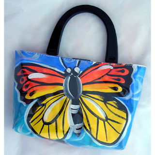
This is another butterfly painting, but this one's for the baby's room. I will resin it, and each butterfly represents a member of our little family.
The other butterfly paintings will all be for sale at the Downlands Art Show at the end of July.
One week to go til baby now. Visited a friend with a new bub today, so it seems a little more real.
28 June, 2007
19 June, 2007
Colour mixing info
This info is taken from the HUGE amount of info on www.goldenpaints.com
Inorganic pigments are derived from natural mineral or ores, commonly referred to as earth colors: Siennas, Umbers, Oxides, Cadmiums, Cobalts and Titaniums. These pigments are like minute rocks: dense, heavy, matte and opaque (light does not penetrate through these materials). The inorganic pigments will mix fairly easily into the acrylic binder and at a higher "load". The paint that is formulated will have more matte opaque pigment in ratio to the glossy binder. Once dry, inorganics have a matte surface.
Organic pigments have been synthetically manufactured in labs within the last fifty years. Organic pigments are formed from complex carbon chemistry and have chemical sounding names: Quinacridone, Naphthamide, Phthalo, Hansa and Anthraquinone. Generally, these pigments are translucent in nature and when viewed through a microscope often look like pieces of stained glass. Light does transmit through these pigments. They are difficult and quite finicky to mix in the acrylic binder. Too much and the paint turns into a thick gummy mess. When the paint is finally formulated it has a high gloss (more binder) and less pigment. This formulation of transparent binder and translucent pigment is a perfect vehicle for the rich glazing quality of GOLDEN Quinacridone Gold.
These matte and gloss characteristics have a lot to do with color, because they affect the way light waves are reflected back. Gloss mediums tend to "punch up" color and matte mediums "soften, or lower the intensity of color. This is discussed in more detail later in the article.
So, what does an inorganic and organic pigment have to do with color mixing? And who should care? You should.
Forget color theory for a moment and let's focus on the reality of pigments. A few simple facts: When Mineral pigments are mixed together, they create a "muddy" or low chroma mixture. When Organic pigments are mixed together, they maintain their brightness and yield clean, high chroma mixtures. Let's mix some examples.Mix a Cadmium Red Medium and Cobalt Blue (inorganics) to create violet. Now use Quinacridone Red and Phthalo Blue (organics) to make another violet. One is not "better" than the other is, but one is certainly of a higher chroma (brighter).
Take a look at the different versions of the Matisse painting below. One is painted with a limited palette of organics and the other inorganics. One is not a better palette than the other, but by understanding the "rules" of pigment mixing, you have solved many color mixing dilemmas and maybe even hours of mixing muddy color.
Reality #2: Pigments
There are two types of pigments that paints are made with: Inorganic and Organic. Each type of pigment has a loading capacity in regards to the binder. To put it simply...
Inorganic pigments are derived from natural mineral or ores, commonly referred to as earth colors: Siennas, Umbers, Oxides, Cadmiums, Cobalts and Titaniums. These pigments are like minute rocks: dense, heavy, matte and opaque (light does not penetrate through these materials). The inorganic pigments will mix fairly easily into the acrylic binder and at a higher "load". The paint that is formulated will have more matte opaque pigment in ratio to the glossy binder. Once dry, inorganics have a matte surface.
Organic pigments have been synthetically manufactured in labs within the last fifty years. Organic pigments are formed from complex carbon chemistry and have chemical sounding names: Quinacridone, Naphthamide, Phthalo, Hansa and Anthraquinone. Generally, these pigments are translucent in nature and when viewed through a microscope often look like pieces of stained glass. Light does transmit through these pigments. They are difficult and quite finicky to mix in the acrylic binder. Too much and the paint turns into a thick gummy mess. When the paint is finally formulated it has a high gloss (more binder) and less pigment. This formulation of transparent binder and translucent pigment is a perfect vehicle for the rich glazing quality of GOLDEN Quinacridone Gold.
These matte and gloss characteristics have a lot to do with color, because they affect the way light waves are reflected back. Gloss mediums tend to "punch up" color and matte mediums "soften, or lower the intensity of color. This is discussed in more detail later in the article.
So, what does an inorganic and organic pigment have to do with color mixing? And who should care? You should.
Forget color theory for a moment and let's focus on the reality of pigments. A few simple facts: When Mineral pigments are mixed together, they create a "muddy" or low chroma mixture. When Organic pigments are mixed together, they maintain their brightness and yield clean, high chroma mixtures. Let's mix some examples.Mix a Cadmium Red Medium and Cobalt Blue (inorganics) to create violet. Now use Quinacridone Red and Phthalo Blue (organics) to make another violet. One is not "better" than the other is, but one is certainly of a higher chroma (brighter).
Take a look at the different versions of the Matisse painting below. One is painted with a limited palette of organics and the other inorganics. One is not a better palette than the other, but by understanding the "rules" of pigment mixing, you have solved many color mixing dilemmas and maybe even hours of mixing muddy color.
The GOLDEN has arrived!!!!
It'll take a few days to unpack, but I'm delighted to announce the range of GOLDEN acrylics, gessos and grounds and mediums has arrived. There's so much to learn about these terrific products - I'm going to post some info to this blog as I discover things that are particularly interesting... and I'll let you know when the range is available for purchase at www.shinyhappyart.com !
17 June, 2007
Love this idea
I've taken to trolling a few artsy/designery blogs of late (because I can't sleep) and I love this idea from here altho I'm not sure how you'd get a portable photobooth to a function ... can't be impossible ...
13 June, 2007
New Bags
The butterfly and gerbera design has made it's way onto my original painted bags and lazy susans as well. These will be added to my site very soon! http://www.annabartlett.com/
04 June, 2007
On a Butterfly Bender
Yes, I think I'm definitely on a butterfly bender at the moment. Today I finished painting this butterfly lazy susan - tomorrow it will be resined. I love what resin does to the colours! Then I will upload all my recent lazy susans to my site - www.annabartlett.com . This one took quite some time to paint, so it will be a little more expensive than the others. I love all the colours!
And the canvas is the butterflies I did as a demo at last weekend's crea8 show. It's going to be resinned tommorrow also and submitted to the Downlands Art Show in July. With this baby coming (maybe next week!) at least something's organised in time!
Now my son wants pancakes for dinner and I think that sounds like a good idea...
Subscribe to:
Posts (Atom)